There’s a lot more difference between Smartphone and PC than just the screen size. They are two entities with completely different sets of attributes. So when we’re planning an app for Smartphones, it’s meant to be started from scratch and not “adapted” from its desktop version at all. But still we see so many apps with almost the same interface and controls but a few minor changes being added to the Play Store. The same thing happens with internet browsers as well. Most of the browsers have capitalised on the same basic approach that was intended for desktop browsers. Though they’ve incorporated a few changes as well, but they’re still not completely faithful to their device. We don’t feel it because we don’t know what better can be achieved. But guess what! Here we have a new web browser that’s tailor-made for Smartphones only. So let’s check it out!
I’m talking about the latest Android app called Tangram that has been developed by Lateral SV. The app is compatible with all the devices running Android 4.0 or any later version of the OS.
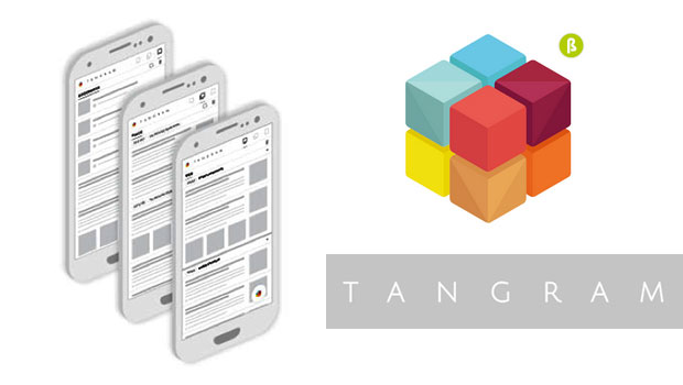
Tangram can be called as the official “Smartphone” web browser. The interface is completely different from what we’ve seen so far. First of all, one of the biggest problems of all browsers is the inability to capitalise on the quick search option. That search space is too small and un-strategically placed on the screen. But here at Tangram, it’s closest to your fingers; right at the bottom-corner of screen. Just tap on it and a whole blank page appears. As you type in, suggestions start appearing and you can choose the appropriate one.
The next change on the list is the way it handles multiple tabs. Right now, what we’re used to is watching one tab at a time and keeping others hidden. But here you can access all of them at the same time, one below the other. You can filter the results in each tab and keep the relevant information only. To delete a tab/link, swipe to the left and if you find it interesting, swipe to the right and it will be added to your “stack” section. This stack section is to analyze your findings and if they’re of any further use, you may swipe them again and add to the bookmarks or you always have the option to delete them. Here you can add notes as well.
Under the bookmarks tab, you can create folders and allocate your results to different sub-categories. This is a far better option than just storing them all under one roof without any rule guiding them. You can also take screenshots with just a tap.
[portfolio_slideshow]
The interface of Tangram is fluidic with heavy reliance on swipe gestures which is the right choice for Smartphone. It’s not just a browser but stores your files and the place where you can read. It might change your habits initially, but only for your own good!
The app is available for free in the Play Store. So don’t forget to check it out!
Pros: fluidic interface; tailor-made for Smartphones; analyze your stacked results; swipe gestures for bookmarks; save images; create folders; powerful quick search option; free.
Cons: none.
DOWNLOAD


