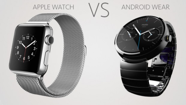
When compared side-by-side, the Apple Watch and Android Wear platforms have some similarities, but not many. A look at Apple’s WatchKit, the programming tools used to create apps, gives a first impression that the Apple Watch’s capabilities are currently limited.
The first release of Google Glass gave developers limited access for building their apps, which captured developers’ imaginations. Nine months later, Google released a comprehensive software development kit (SDK.) After listening to Augmate senior engineer Mike DiGiovanni’s talk comparing WatchKit and Android Wear at the Wearable Tech Conference, the Apple Watch-like early Google Glass appears incomplete, and will likely get a comprehensive SDK update after Apple has field-tested WatchKit with its developer community.
The Apple Watch is the company’s first entirely new platform since the iPhone in 2007. Macs, iPhones, iPads, and iPods all evolved from platform products introduced during the previous decade, or even earlier. Apple gave developers a preview version of WatchKit last November, but Apple has only shipped a few watches to launch partners, such as Runkeeper and Alarm.com, for app testing. The majority of developers haven’t actually seen the hardware. The Apple Watch is a new platform because developers must learn new design and development principals to create a different kind of app. Developers will find XCode used to program the iPhone familiar on WatchKit, but creating an app for the Apple Watch with Apple’s five-second limit guideline on user interaction is a lot different than building iPhone apps for social media, gaming, messaging, and productivity that engage users for minutes or tens of minutes.
Android Wear consists of Android with the addition of wearable user interface (UI) extensions. It’s a complete operating system capable of autonomous app execution. The Apple Watch, on the other hand, acts more like a dumb terminal connected to an iPhone host. At this point, WatchKit apps seem to be designed for presenting and interacting with notifications.
Apple Watch notifications are very similar to those used with Android Wear. Short notifications of the status of a smartphone app are sent to the watch to inform the user of a sports score, a message, a change in the weather, an upcoming meeting, etc. Notifications are the staple of smartwatch apps.
Notifications are where the similarities between the Apple Watch and Android Wear start and end. Many UI elements that developers are familiar with aren’t available with WatchKit. The iPhone must initiate all actions on the Apple Watch.
Interactions with WatchKit and Android Wear apps have some similarities with touch and vertical swipes, but overall they are significantly different. So dissimilar that an app would need to be completely redesigned for each device.

The philosophical differences of the designers of the two devices are best understood by comparing interactions. The small screens on smartwatches limit interactions to taps and swipes. Apple introduced Force Touch on the Apple Watch, a touch and momentary hold function that brings up the equivalent of a context menu. Android Wear allows multitouch that uses two fingers to distinguish from a tap to bring up something like a context menu or other option. Android Wear has free-form gestures and includes horizontal swipes, both omitted on the Apple Watch. Android Wear’s vertical and horizontal swipes are a significant advantage compared to WatchKit. Think about this like looking through a knot hole at a large surface of data. Swipes up and down, right and left allow the user to view the entire surface. With just vertical scrolling through the Apple Watch’s knot hole, only a very long ribbon of data can be viewed.
Given the small watch screen size, voice recognition and speech-to-text capabilities are essential for navigation. The most glaring WatchKit interaction category omission is voice recognition and text-to-speech on the Apple Watch. Though Apple’s internal developers have access to the Apple Watch’s Siri speech API, independent developers can’t create voice commands or convert text to speech. Independent iPhone developers use third-party APIs to create voice features, but based on developer documentation it looks impossible to port these APIs to the Apple Watch unless WatchKit and the Apple Watch get a big SDK update. Android Wear uses voice features and developers have access to them.
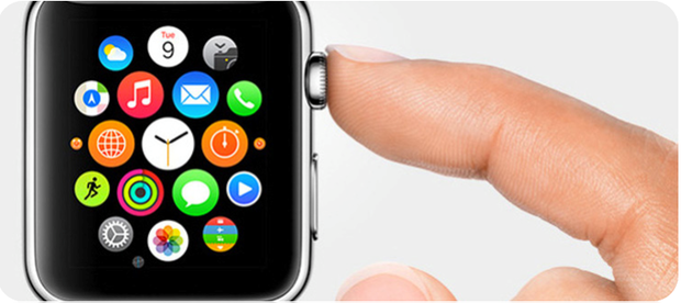
Though unconfirmed at this time, the Apple Watch bubble app launcher may be a breakthrough UI. It uses the crown as a home button and twists to navigate through app icons and launch the desired app.

On Android Wear, users launch apps by scrolling down to the start button and then selecting the app or with the voice command: “OK Google, start [app name].” Independently developed Android Wear bubble launchers are available, but these UIs may require more dexterity than the Apple Watch because Android smartphones don’t have a crown. Given the omission of voice capabilities on the Apple Watch, the app launcher user experience may be a draw.
There are a number other indications that an SDK update is coming to the Apple Watch. Most of these omissions are implemented in Android Wear. The familiar iPhone UI animations for screen interactions and transitions aren’t available. Custom views also aren’t available, and the screen layout isn’t addressable with xy coordinates. The views are generated with Watchkit using Storyboard with limited adjustment by the developer. WatchKit apps can’t access the Apple Watch’s sensors. Finally, developers can’t use the crown – potentially the most important feature on the Apple Watch – as a UI element to navigate and select WatchKit options.
Apple is in new territory – it needs more complete resources for developers to build apps. The company isn’t sure what a killer watch app looks like; in fact, no one is. That’s why WatchKit is limited. In the next six to nine months, Apple needs to gain an understanding of what developers need to build a killer app, and add it to WatchKit.


